Here’s What the “Yield Curve” Really Means for Your Portfolio
Michael Foster, Investment StrategistUpdated: April 15, 2019
There’s a three-word phrase that’s terrifying just about everyone these days. If you take it at face value, it could trick you into making a dangerous mistake with your retirement.
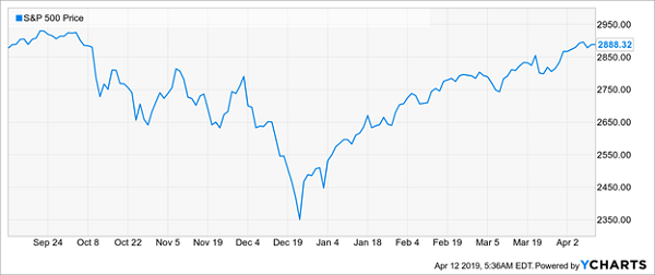
It springs from the following chart:
The Yield-Curve Panic
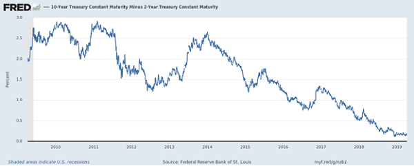
This chart tracks the spread between yields on the 10-year Treasury and the 2-year Treasury. In normal times, the shorter-term bond pays a smaller yield than the longer-term bond. But the difference between the two has gotten smaller and is now close to going negative.
That’s where our dangerous phrase comes from: this situation is known as an inverted yield curve.
The upshot?… Read more